
Using Colour on an Exhibition Stall: A Practical Guide
How to use colour on an exhibition stall: balancing brand colours with neutrals, matching paint and print, colour under hall lighting, and mistakes to avoid.
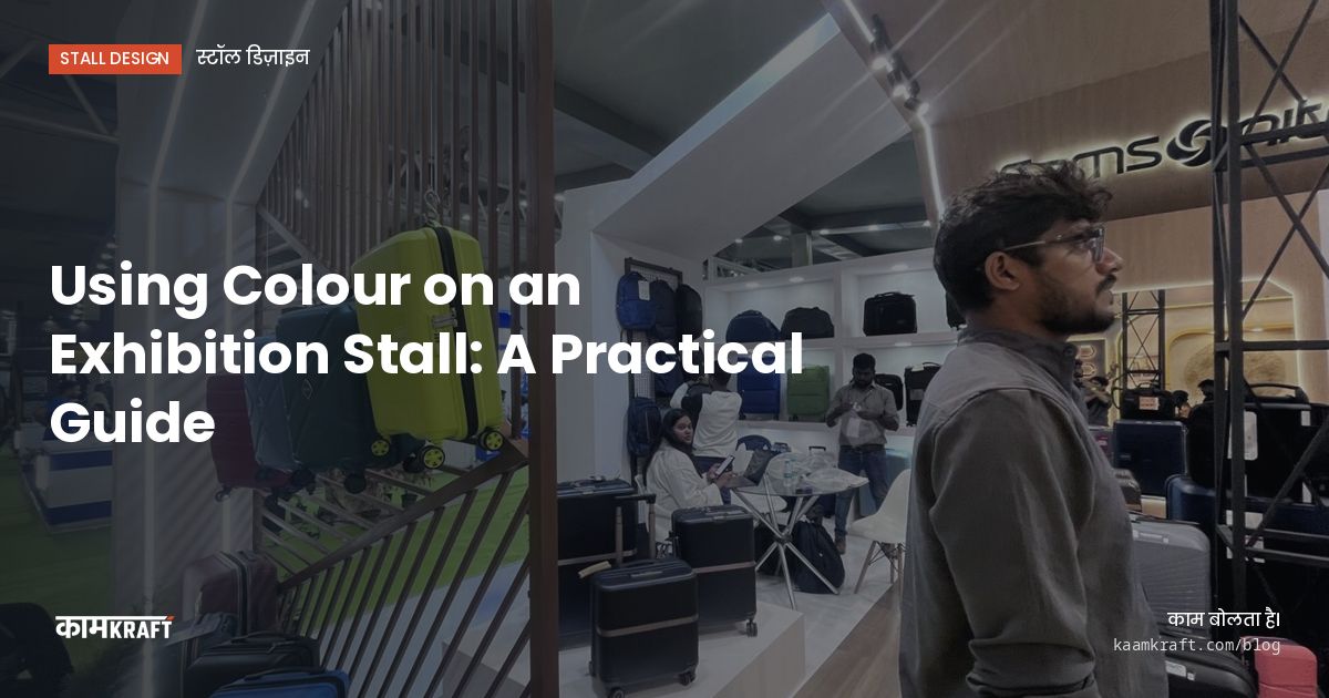
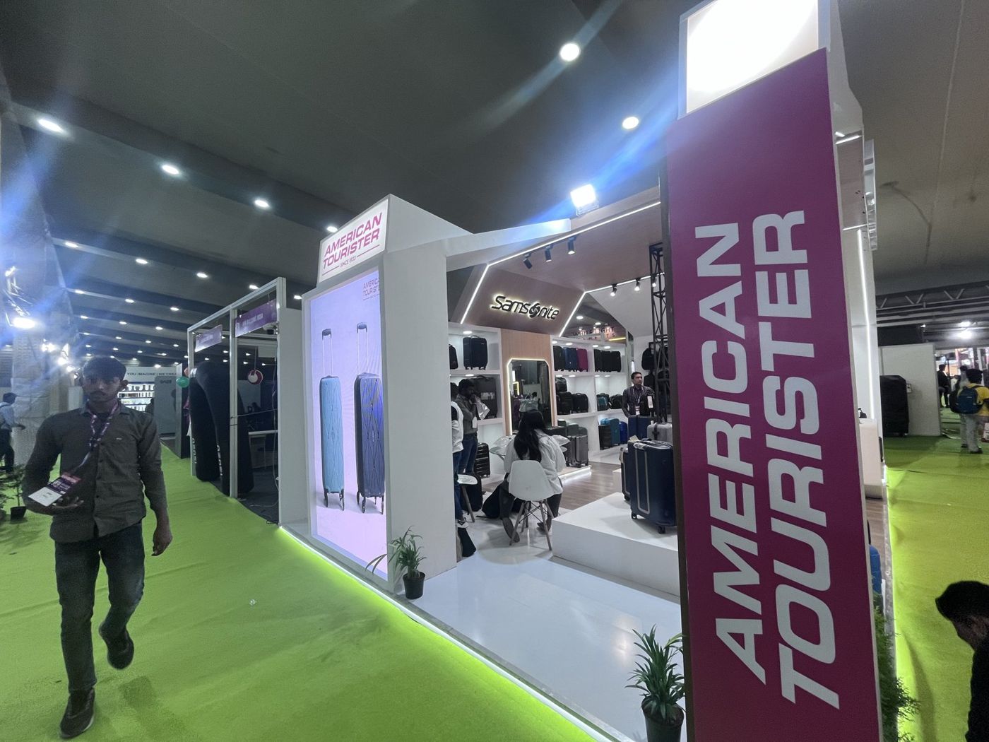
Use one strong brand colour, one or two supporting colours, and a neutral base, usually white, grey, black or a wood tone. The strong colour goes where you want attention: the fascia, a feature wall, the hero product backdrop. The neutral holds everything together and lets your products stand out. Most stalls that look busy or cheap have too many colours at equal strength.
Colour on a stall is also a production problem, not just a design choice. Paint, laminate, printed vinyl, fabric and LED light all render the same brand colour differently, and the hall's lighting changes it again. Getting it right means choosing colours that survive all of that.
A simple colour plan for most stalls
Think of the stall in three layers. Each layer has a job, and giving each a set share of the surface keeps the design calm.
- Base: walls, platform edges and most furniture in a neutral that suits your brand. This is the largest share.
- Brand colour: fascia, one feature wall, counter fronts or a band that runs around the stall. Enough to be recognised from a distance.
- Accent: a second colour for small details such as shelf edges, signage strips or a lit panel. Used sparingly.
- Products: your products bring their own colours, so leave space around them rather than competing.
White is popular as a base because it reflects light and makes a stall look larger, but it shows dirt and scuffs over a long show. Light grey or a textured white laminate is more forgiving on counters and lower walls. Black or charcoal works well for premium products and lit displays, though it needs more lighting to avoid looking heavy.
Matching brand colours across materials
Your brand guideline probably gives colour codes for print and screen. A stall uses many more surfaces than that, and each one needs its own match.
Paint
Paint is mixed to a shade card or a physical sample. Screen colours rarely translate exactly, so share a printed or physical reference and approve a painted swatch before the full stall is painted. Gloss level matters too: a matt finish looks richer and hides small marks, while gloss reflects hall lights.
Printed vinyl and fabric
Printed graphics depend on the printer, the ink and the material. Fabric prints often look slightly softer than vinyl. If a printed panel sits next to a painted panel in the same brand colour, ask for a test print and check them side by side under similar light, because small differences become obvious when they touch.
Laminates and ready finishes
Laminates come in fixed shades. You pick the closest available rather than mixing an exact match, so use them for neutrals and wood tones, and keep exact brand colours for paint or print.
How hall lighting changes colour
Exhibition halls vary a lot in their general lighting, and some have daylight from skylights or open sides. Your stall's own lights then add another layer. A red that looks right in the factory can turn orange under warm light or dull under cool light.
- Choose a colour temperature for the stall lighting early and use it consistently.
- Approve paint and print samples under similar light, not just on a screen.
- Light brand colour walls evenly, since patchy light makes a solid colour look uneven.
- Be careful with coloured LED light on coloured surfaces, as it can shift or wash out the brand shade.
- If you show products where colour accuracy matters, such as textiles, paint or cosmetics, ask for lights with good colour rendering.
Colour and the space around you
Your stall sits among dozens of others, and the hall carpet is often a fixed colour you cannot change. Look at last year's photos of the show if you can, to see what the aisles look like. If neighbours are likely to use loud colours, a calmer stall with one strong accent can stand out more than another bright one.
If your stall has its own flooring or a raised platform, the floor colour becomes part of the palette. A dark floor makes a white stall feel crisp. A brand-coloured carpet makes a strong statement but can feel heavy on a large stall. Floor finish and colour are planned together as part of every custom exhibition stall we build.
Small stalls and large stalls
On a 3x3 or 6x3 stall, a strong colour on every wall can make the space feel cramped. Keep the brand colour to the fascia or the back wall and leave the side walls lighter. On a large island, you have room for bolder blocks of colour, but break them up with neutral zones so meeting areas and product displays feel calm. Either way, test the plan in the 3D view from the aisle, not just from above.
Common colour mistakes
- Using every colour in the brand guideline at once, so nothing stands out.
- Approving colours only on screen, then being surprised by the painted result.
- Putting brand-coloured text on a brand-coloured background with too little contrast to read.
- Choosing pure white for counters and lower walls that will be scuffed by shoes and bags.
- Forgetting that the logo needs a clean, contrasting background to be read from the aisle.
At our factory we paint and finish panels in-house and dry-assemble the stall, so you can check colours together before the stall is packed. If you exhibit often, keeping a fixed colour plan also makes reusing stall parts much easier from show to show.
Planning a stall?
Share your brand guideline, any physical colour references and your show details, and we will propose a colour plan that works in paint, print and light. Start with Plan your project, or WhatsApp or call +91 70190 58391.