
Corner Stall Design: How to Use Both Open Sides Well
How to design a corner stall with two open sides: read the busier aisle, use the open corner, pick an L-shaped or diagonal layout and check the right rules.
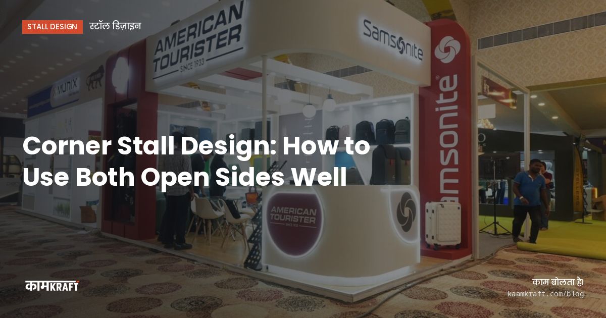
A corner stall gets visitors from two aisles, but only if both faces are designed to work. The common mistake is treating one side as the front and the other as an afterthought, with a blank wall or a stack of brochure stands. Use one face to stop people and the other to let them in, and keep the brand on the two closed walls at the back.
In practice, that means a strong visual on the corner where the two aisles meet, open entries on both sides, and your working zones (counter, meeting table, storage) pushed against the closed walls.
Know which aisle is busier
Two open sides rarely get equal traffic. One aisle is often a main route from an entrance, a food court or a large neighbouring stall, and the other is quieter. Study the floor plan before design: where the hall entrances are, where the big stalls sit, which aisle looks wider. If you can, ask the organiser or walk the hall at a previous edition.
Design the busier face to attract and the quieter face to host. The busy side carries the hero display and the brand. The quieter side holds the meeting table, where conversations are not interrupted by passing crowds.
If both aisles look equally busy, do not split the difference with two weak faces. Pick the side that visitors reach first from the nearest hall entrance and make it the stronger one. The second face can still attract, but with a different message, so a visitor who walks round the corner sees something new rather than the same graphic again.
The open corner is your most valuable point
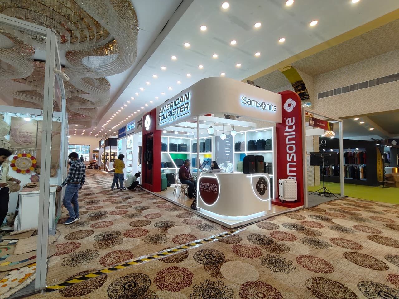
The point where your two open sides meet is visible from both aisles and from a distance along each. Put something there that works from many angles: a tall pillar with your logo on every face, a fascia that wraps the corner, a product on a rotating plinth, or a lit totem. Keep it slim so it does not block the view into the stall.
Avoid a solid wall on the corner. It cuts off both sides at once and turns the stall into two separate inline stalls.
Layout patterns for corner stalls
L-shaped back wall
The two closed sides form an L. Run the main brand graphic along both, with the logo where it can be seen from the far end of each aisle. Displays and counters sit along the L, and the centre stays open. This is the most common and reliable pattern.
Diagonal split
Draw an imaginary line from the open corner to the closed corner. One triangle becomes the display and demo zone, the other the meeting zone. A low wall, shelf unit or planter marks the split without closing the stall.
Wrap-around fascia
A header that runs along both open sides and curves round the corner frames the stall from both aisles. It helps brand recall but adds structure and cost, and it must stay within the organiser's height limit. Check whether overhead elements need separate approval.
Demo point on the corner
For products that draw a crowd when they run, put the demo right at the open corner, on a low plinth or a turntable, with the brand on the closed walls behind. People gathering to watch are visible from both aisles, which pulls in more people. Keep the demo set back far enough that the crowd stands on your floor, not in the aisle, and plan a clear path past it to the counter so serious visitors can reach your team.
What to check in the exhibitor manual
Corner stalls bring rules that inline stalls do not. Read these before you approve a design:
- Maximum wall height along open sides, and how far from the aisle edge a wall can start.
- Whether part of each open side must stay open. Some shows set this to stop corner stalls becoming walled boxes.
- Rules for finishing the back of walls that face neighbours.
- Whether a fascia or overhead structure needs structural drawings.
- Where the organiser supplies power from, which affects where screens and lightboxes can go.
Mistakes that waste a corner
- One dead side. A blank wall or a brochure rack on the second face wastes the extra frontage you paid for.
- Counters on both open sides. Two counters form a fence. Use one, set back, or none.
- The same graphic on both faces. Each face can carry a different message: one for the brand, one for a product or offer.
- Staff facing only one aisle. Position people so someone can greet visitors from each side.
- Forgetting distant sightlines. Check the design from the far end of each aisle in the 3D model.
Corner stalls at large venues
In big halls like BIEC Bengaluru, aisles can be long and visitors see you from far away, so height and the corner feature matter more. At a construction show like ACETECH Mumbai 2026, from 19 to 22 November at the Bombay Exhibition Centre, a building-materials brand might use one face for a material wall and the other for a quiet sample table where architects can sit.
We design corner stalls in 3D, build and dry-assemble them at our Bengaluru factory, and install with our own crew. See more about our exhibition stalls.
Planning a corner stall?
Send us the floor plan with your stall marked and both aisle widths if you have them. We will show you how each face works in 3D before anything is built. Start through Plan your project or call or WhatsApp us on +91 70190 58391.