
3x3 Stall Design Ideas That Do Not Look Like a Shell Scheme
Ideas for a 3x3 exhibition stall that looks custom built: solid walls, one hero element, raised floor, own lighting and layouts that keep the front open.
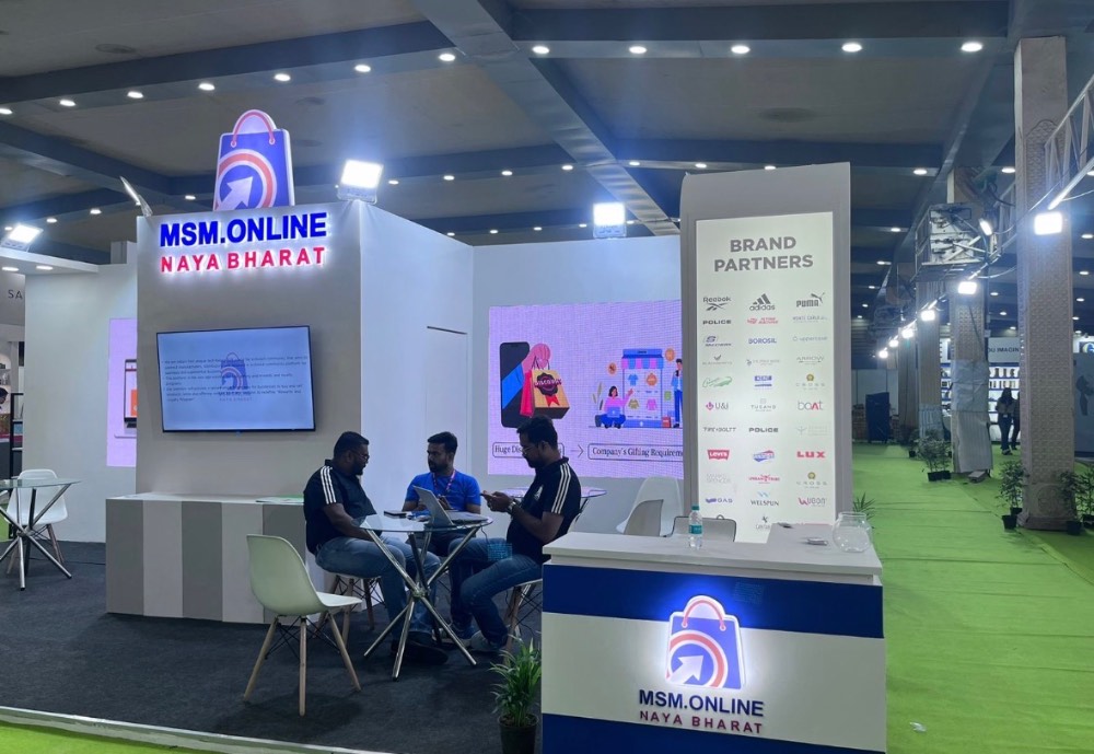
A 3x3 stall looks like a shell scheme when it uses the organiser's system walls, a fascia board with your name cut in vinyl, and a table pushed to the front. To make nine square metres look built, you need three things: walls that are yours, one strong focal point, and a layout that leaves the front open.
None of this needs a big budget. It needs decisions made early, a clear idea of the one thing you want visitors to see, and a fabricator who plans the small space in 3D before cutting a single board.
Book bare space, or know the shell scheme limits
Many organisers sell 3x3 stalls as shell scheme by default. If you want a custom build, check whether the show offers bare space at that size, or whether you can book shell scheme and ask for the walls and fascia to be removed. Rules differ by show, so confirm in the exhibitor manual whether removal is allowed, whether you still pay for the shell package, and the deadline for telling the organiser.
Also read the height limit, the rules on side walls shared with neighbours, and whether the back of any wall facing a neighbour must be finished. On a 3x3, these rules shape almost every design choice.
Five ideas that make a 3x3 look custom
1. Build solid walls, not panels
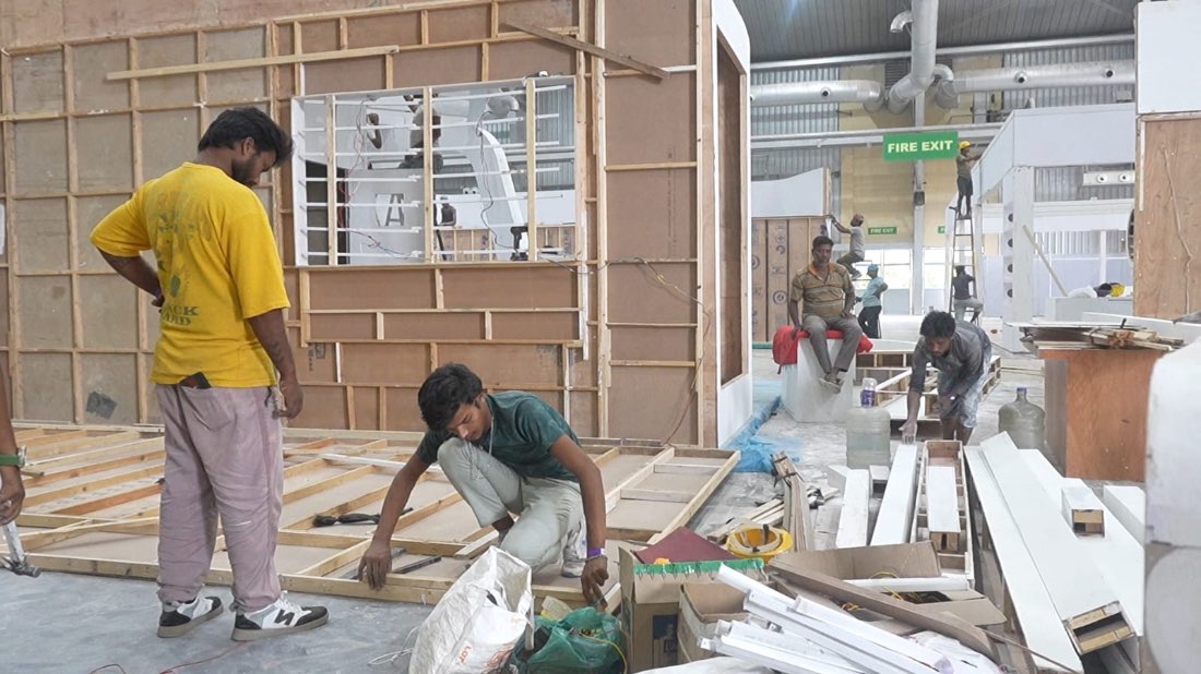
The fastest change is replacing system panels with built walls in timber or board, finished in paint or laminate. Solid walls have no visible joints or aluminium posts, so the stall reads as one object. We frame and finish walls at our Bengaluru factory and dry-assemble them before they travel, so the joints stay tight on site.
2. Use one hero element
A small stall cannot carry five messages. Pick one: a lit logo, a product on a plinth, a single large image, or a screen running a short loop. Put it on the back wall, centred or slightly off-centre, at eye level. Everything else stays quiet.
3. Raise the floor
A low platform with a finished edge separates you from the aisle carpet and makes the stall feel like a room. Check edge and ramp requirements in the manual, because a step on a small stall can catch visitors' feet.
4. Float the fascia or skip it
A shell scheme fascia is a flat board across the front. Instead, try a header that sits on the back wall and projects slightly, a curved top edge, or no front header at all with the name high on the back wall. On a 3x3, an open top makes the space feel taller.
5. Light it yourself
Shell scheme lighting is usually a few clip-on spots. Integrated lighting, such as LED strips in shelf edges, a backlit logo or a lit fabric panel, changes the look completely. Check your power allowance before you design, because a small stall often comes with a small electrical load.
Layouts that work in nine square metres
A 3x3 has room for about one counter, one display and two or three people standing. The layout decides whether visitors step in or talk to you from the aisle.
- Back-wall display, open front: the hero sits on the back wall, a slim counter sits to one side, and the front edge stays fully open. Best for brand and product awareness.
- Angled side counter: a counter set at an angle on one side pulls visitors diagonally into the stall and keeps the centre free.
- Corner pocket: if the 3x3 is on a corner, use one open side for the display and the other for entry. The same thinking applies to our larger custom exhibition stalls.
- Demo first: a single waist-high table near the front with the product on it, and the back wall carrying the brand. Works for hands-on products and software demos.
Avoid a table across the full front. It forms a barrier, staff end up sitting behind it, and visitors read it as a sign not to enter.
Storage and clutter: the hidden problem
The quickest way to make a smart 3x3 look cheap is cartons in a corner, a bag on the counter and a tangle of chargers. Plan storage before the show, not on day one.
- Build a lockable cupboard into the counter for brochures, giveaways and personal bags.
- Hide a small store behind a false back wall if the design allows a gap of a few hundred millimetres.
- Run cables inside walls and counters, with one charging point under the counter for phones and card readers.
- Keep only one day's brochures on the stall and the rest in your vehicle or the venue's storage, if it offers any.
Mistakes we see on small stalls
- Too much text. Visitors give a 3x3 two or three seconds as they walk past. One line on what you do and a logo is enough.
- Too many products. Bring the two that start conversations and keep the rest on a tablet or in a printed catalogue.
- Dark colours everywhere. Deep colours look rich in a render but shrink a small space under hall lighting. Use them as accents.
- Late approvals. Custom 3x3 builds still need drawings submitted to the organiser, and missing the deadline can push you back into shell scheme.
- Staff blocking the entrance. Brief the team to stand to one side, not in the opening.
Can a 3x3 be reused?
Yes, and small stalls are often the best candidates. Walls, counter and lightbox can be designed as modules that pack flat and rebuild in a slightly different shape at the next show, with only the graphics changed. If you exhibit at several regional events a year, ask about reusable stall builds at the design stage, because reuse has to be planned into the joinery and finishes from the start.
For example, a startup exhibiting at Bengaluru Tech Summit 2026, at BIEC from 17 to 19 November, could carry the same modules to a smaller regional event later and swap only the printed panels.
Planning a 3x3 stall?
Send us your stall number, the show name and the one thing you want visitors to remember. We will come back with a 3D design and a build plan. For shows in Karnataka, brief us 3 to 4 weeks ahead; for the rest of South India, 4 to 6 weeks; elsewhere, 6 to 8 weeks. Start through Plan your project or call or WhatsApp us on +91 70190 58391.